Built for the people who use it
The committee this was built for is mostly elderly. That is not a note at the end of the design; it is the design. Below is what it changed — written as the rules the program is actually tested against, not as a claim about caring.
Nothing is ever greyed out without saying why
Choose something on the page, and what you can do to it appears beside it, each with a sentence saying what it is for. A command that does not apply to what you have chosen is simply not there. A command that applies but cannot run right now stays pressable and tells you why in plain words.

In the menus, unavailable commands still grey — that is a convention screen readers announce, and discarding it would trade one confusion for another. But every one of them carries the same plain sentence, and choosing it writes that sentence along the bottom of the window.
The floors, and they are enforced
- 16 point minimum for anything you press or read in the program's own chrome, 18 to 20 in the wizards.
- 44 by 44 pixels minimum for anything you have to hit.
- Every command has a keyboard path and a menu entry. Dragging is always an accelerator, never the only way to do something.
- An icon never appears without its label. There are no icon-only buttons anywhere.
- Colour is never the only signal. Anything that changes colour to tell you something also changes shape, thickness or wording.
- Every control has a name a screen reader can read, including the page canvas, which describes what is on the page rather than announcing a blank rectangle.
These are not aspirations. Each is a test that fails the build: a new button with no name, a shortcut with no menu entry, or a command that could become unavailable without a written reason stops the program from being released.
Two settings, in one small window
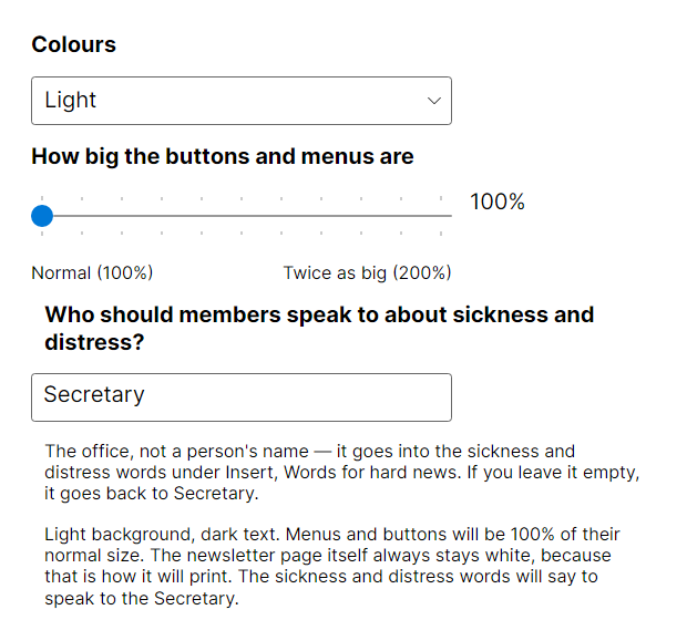
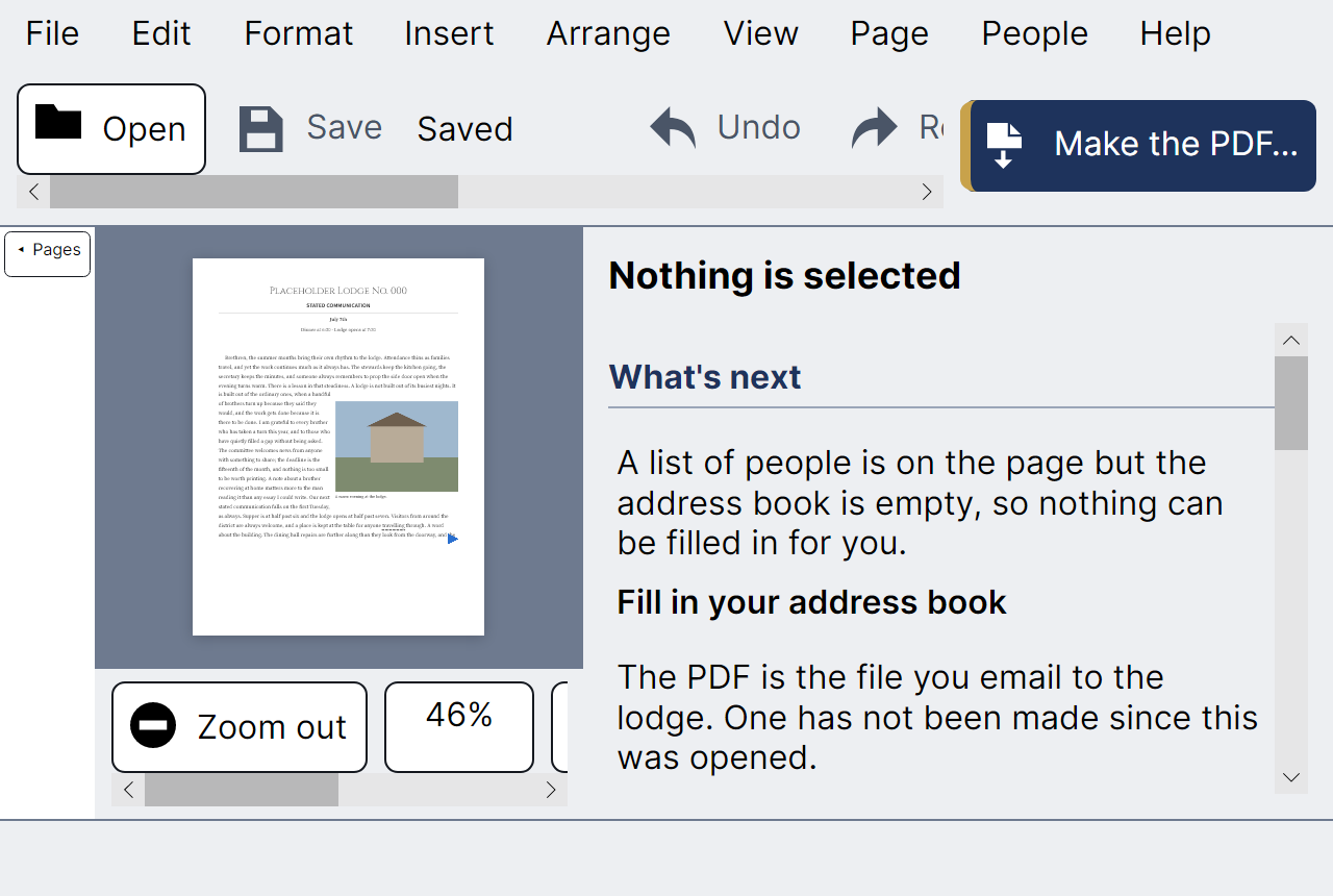
The whole interface scales to twice its size without the page changing, because the page is a piece of paper and has a zoom of its own. Menus, buttons, panels and wizards all grow; the newsletter keeps its proportions, because what you are laying out has to print the way it looks.
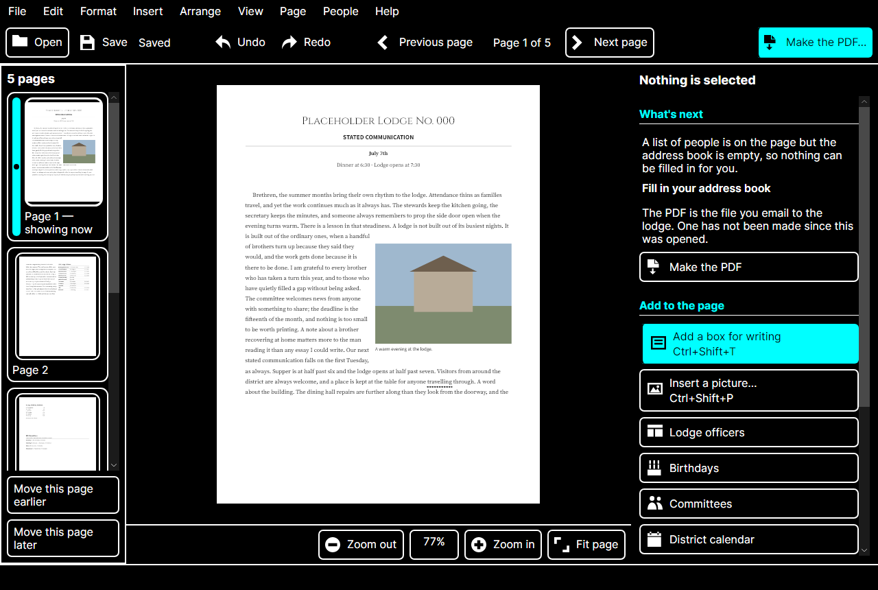
A real high-contrast theme
Not a dark theme with the brightness turned up. Every pairing of text and background is measured and holds at 7:1 or better, borders thicken so that no meaning rests on colour alone, and the newsletter itself stays white — because it is paper, and paper does not have a theme.
It reads the newsletter aloud
Read it back to me… reads the issue in your computer's own voice, highlighting each sentence on the page as it is spoken. It is meant to complement a screen reader, never to replace one — and it catches, in a way that reading with your eyes does not, the sentence that came out wrong.
Forgiveness, everywhere
Unlimited undo. Saving every minute without being asked. Confirmations that say what will happen and that you can take it back. Wizards that read out what they are about to write before they write it. A restore window that shows a picture of the work it is offering you.
The thread through all of it is that this program is used by people who have been told, often, that computers are unforgiving and that mistakes are theirs. It is built to disagree.